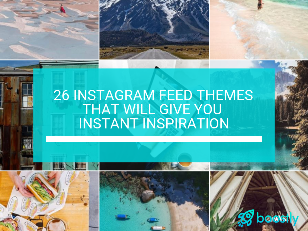
26 Instagram Feed Themes That Will Give You Instant Inspiration
Looking to change up your Instagram feed? Or perhaps you simply just do not know how to tie everything together so that your feed looks as put together as possible. Creating and maintaining solid Instagram feed themes is one of the more challenging parts of running an account. Yes, it definitely helps to plan things out in advance so you can visualize what your next month of content will look like, but what is the best aesthetic to go for?
First off, why are Instagram feed themes so vital? Let’s put it this way – Individual posts are incredibly important for keeping the followers you currently have engaged, but the key to gaining NEW followers is having an aesthetically pleasing Instagram feed. You know, the one that makes you want to scroll down the page for ages until you’ve seen everything.
Think about it as though your feed is the front door to your home. If the doorway is not inviting, people are not going to want to enter – or even walk near it for that matter.
Essentially, it all comes down to this – your Instagram feed theme is what people are looking at when they are in the 3 second decision making process of whether or not they’ll follow you.
As social media marketers or Instagram users in general, it’s our job to keep up with what’s trending. That’s why we’ve created a list of the 26 most popular Instagram feed themes. Regardless of what you’re page is all about, we’re sure these Instagram feed themes will give you some inspiration for your own account!
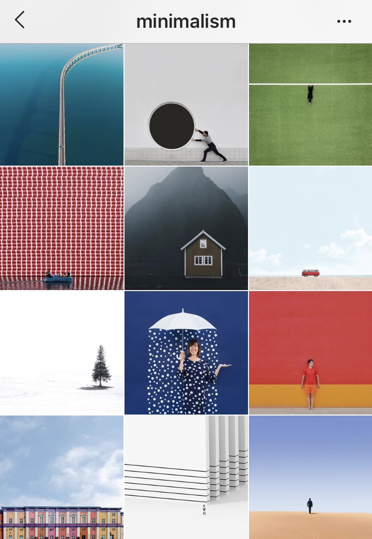
1. Minimalist
Plain and simple with this Instagram feed theme – Less is more. With a minimalistic approach, it will leave your feed feeling tidy and calming to the eye.
Great for photographers, artists, foodies.
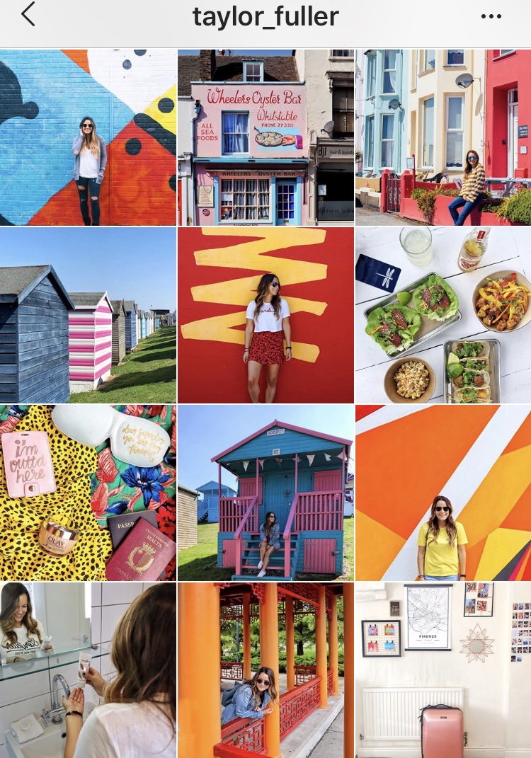
2. Color Block
The bolder the better with this theme! The idea is to use the most colorful content possible making sure it fills every corner of an image. Once all photos are posted together, it will make your feed one bright big beautiful rainbow.
Great for anyone!
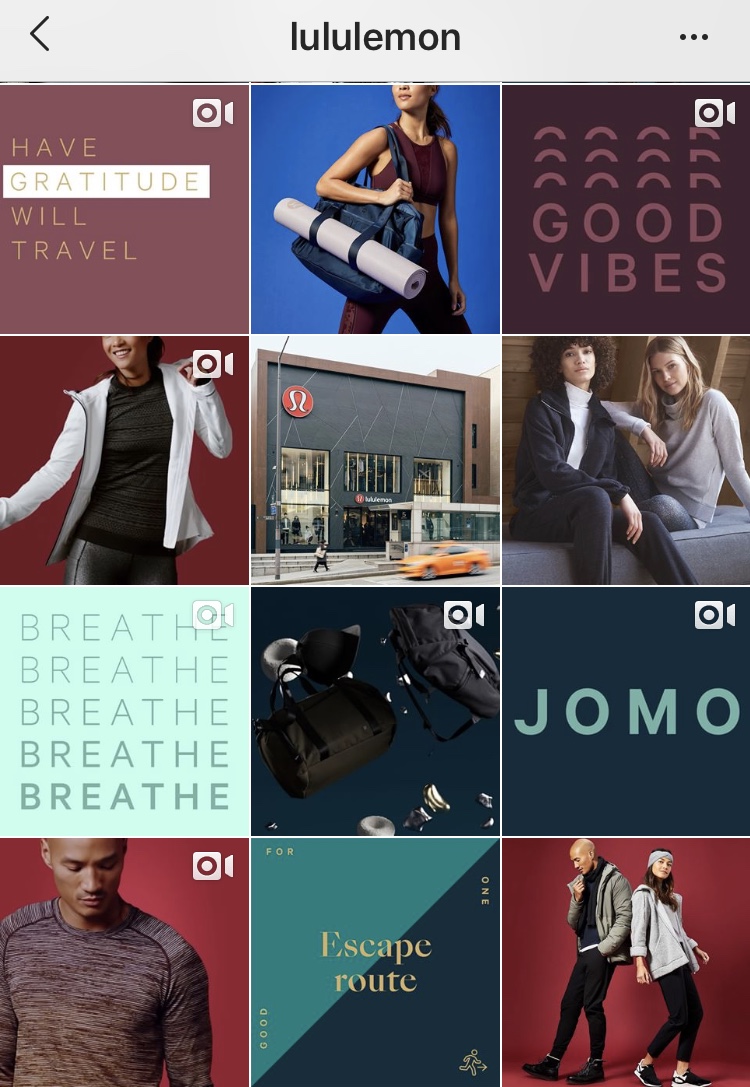
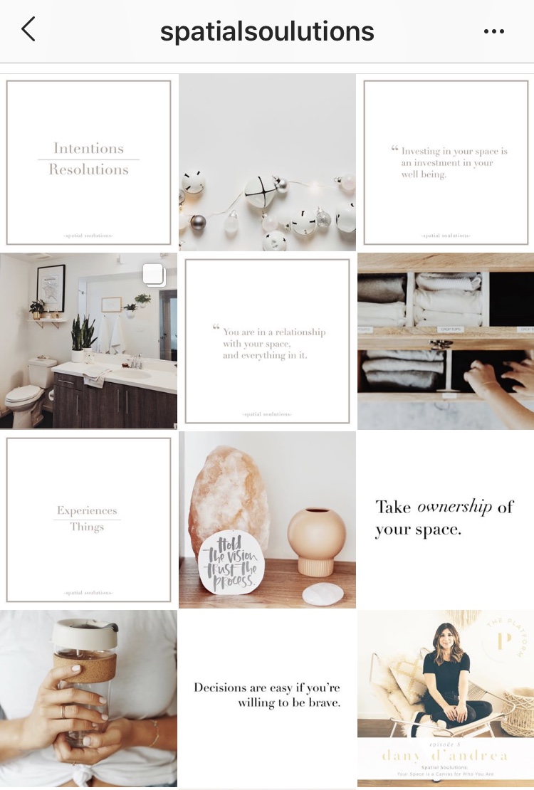
3. Text Blocks
An effective way to add content and create a general vibe for your account is to add posts consisting of text throughout your feed. You’ll have to make sure the coloring matches your image content as this is what will bring it all together.
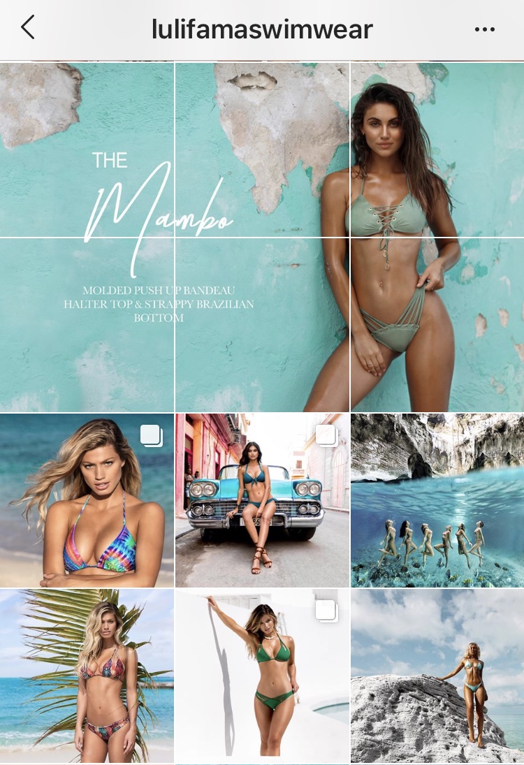
4. Puzzle
This theme is often used to make announcements so that it grabs the attention of the viewer since it stands out amongst the rest of your feed. It looks great when looking at the feed as a whole.
It’s recommended to utilize this technique sparingly as it can be cluttering for your current followers since you have to post several images at once to finish the puzzle.
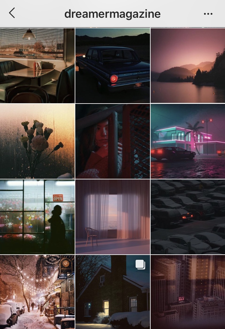
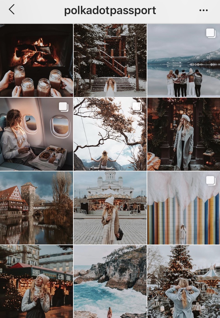
5. Dark
Another way to bring your content together is to make sure they are all edited in the same fashion. Many accounts are using darker tones to edit their photos, which creates a dreamy, mystical feel to the Instagram feed.
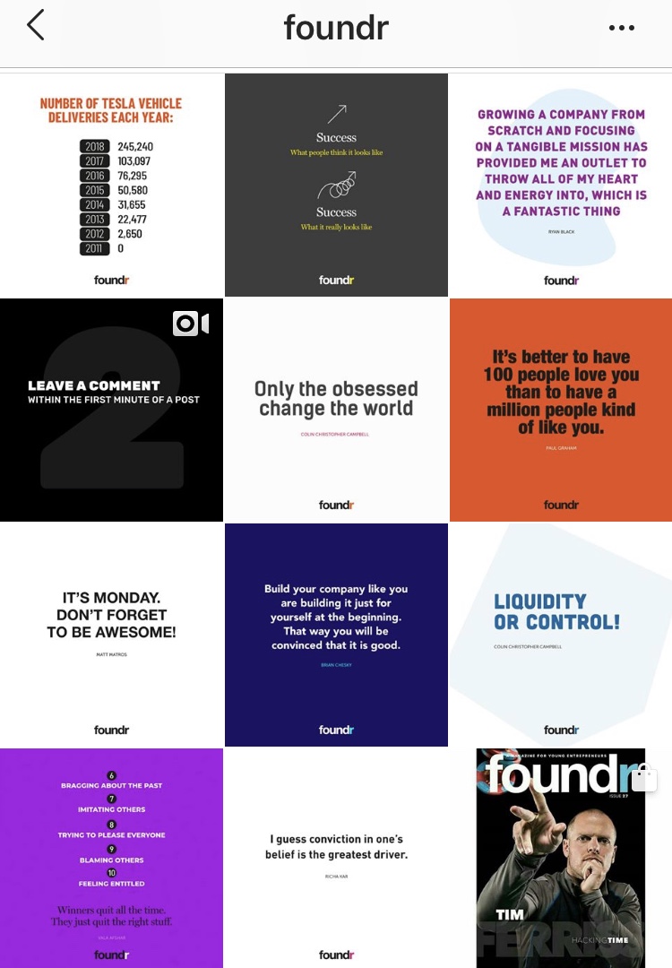
6. Text
Many startups, apps, news sources and inspirational accounts create feeds where all posts are text. This works well as it gives the viewer visual insight into the type of information you share without them having to read through your captions. Remember, people want to be visually stimulated, then they’ll read further.
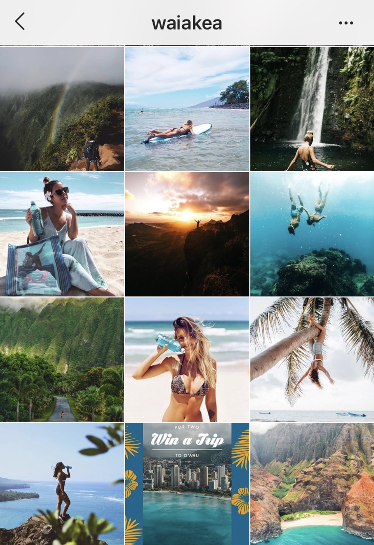
7. Alternating Focal Point
Right, left, up, down. Zoomed in, zoomed out. Alternating focal points between each post will create movement throughout our feed, keeping the viewer engaged for longer when scrolling.
8. Same Filter
Probably the easiest way to achieve consistency throughout your feed, throw the same filter on all of your images to create the same color tone! This will create an orderly feel to your feed while still allowing you the freedom to post whatever you want.
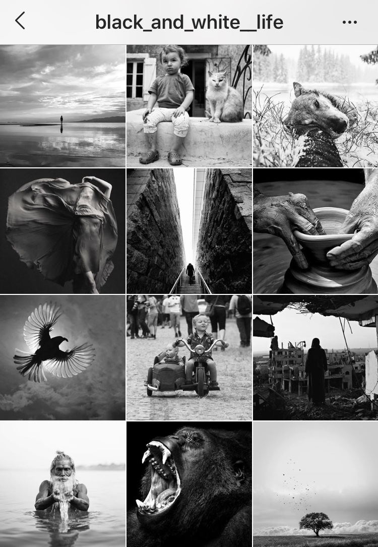
9. Black & White
A classic approach in making your Instagram feed come together – make everything black and white!
It may seem simple but getting the right black and white images is quite a task to take on. When done well, the feed has a consistent flow and the black and white images keep the theme chic and classy.
Plus, there are different tones of black and white you can use so the contrast doesn’t have to be as intense. Especially great for portraits, film and street photography.
10. Vertical Theme
Again, a very organized take on creating your Instagram feed theme, but an amazing way to tell a story a as whole instead of doing it just through individual posts.
You’ll most likely have to post 3 images at a time to keep the feed theme regular.
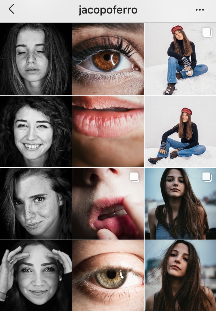
11. Checkerboard
This theme is done when you have two alternating types of content. Switch back and forth between the two and you’re good to go!
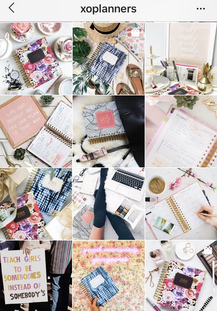
12. Flat-lay
A great theme for product placement as it’s one of the best ways to showcase what you’re selling. Great for food blogs, jewelry brands, clothing labels.
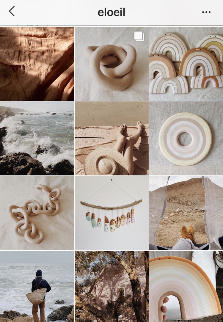
13. Color Co-ordinated
The color co-ordinated theme ties everything together through a selection of colors. If you’re using this tactic, make sure you’ll be able to stick to a certain color palette (such as neutrals below) since this is what will tie your images together.
You’ll also have to plan your content in advance to make sure your images have similar colors between them.
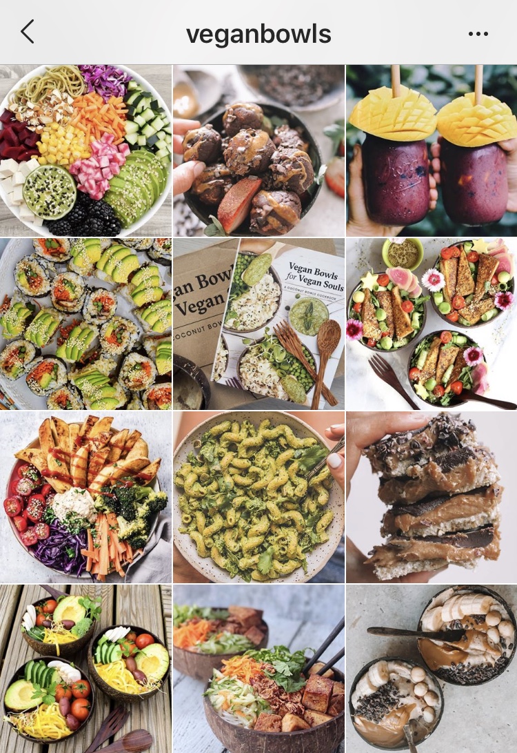
14. Close Ups
This helps to eliminate a lot of empty space in your feed keeping things fun and busy. Quite the opposite of the minimalistic approach, but this style works great as well!
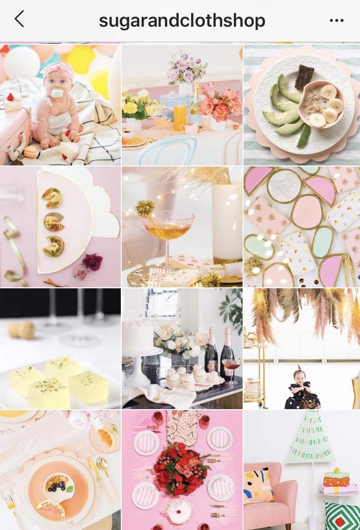
15. Pastel
A great way to bring together bright content. This is a good option if you want your Instagram feed to be colorful without being too loud.
16. Color Focus
Instagram accounts who use color focus use one color as the theme of their Instagram feed. It makes individual products stand out, yet brings the entire feed together.
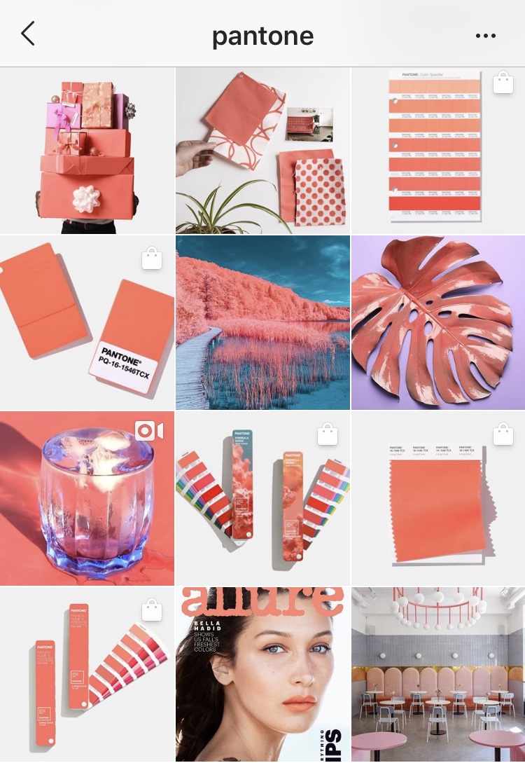
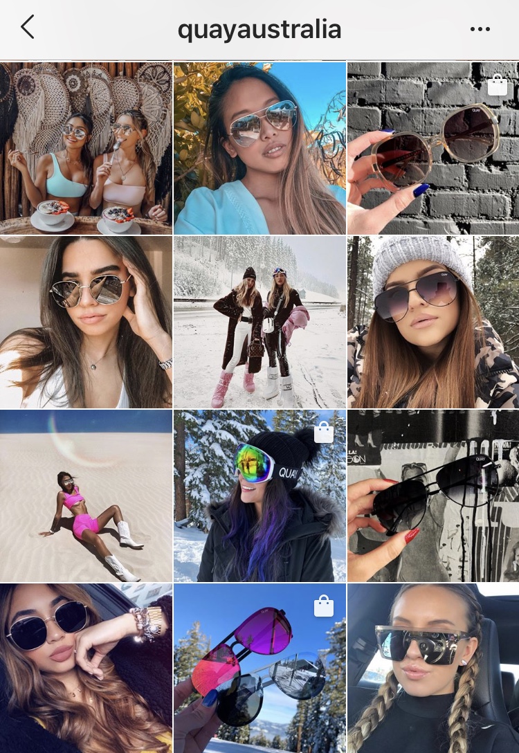
17. Unedited Content
Unedited user-generated content is making a comeback across the feeds of many brands. It certainly adds a genuine touch to your feed while allowing users to visualize what your product looks like in real life.
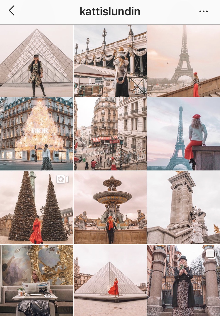
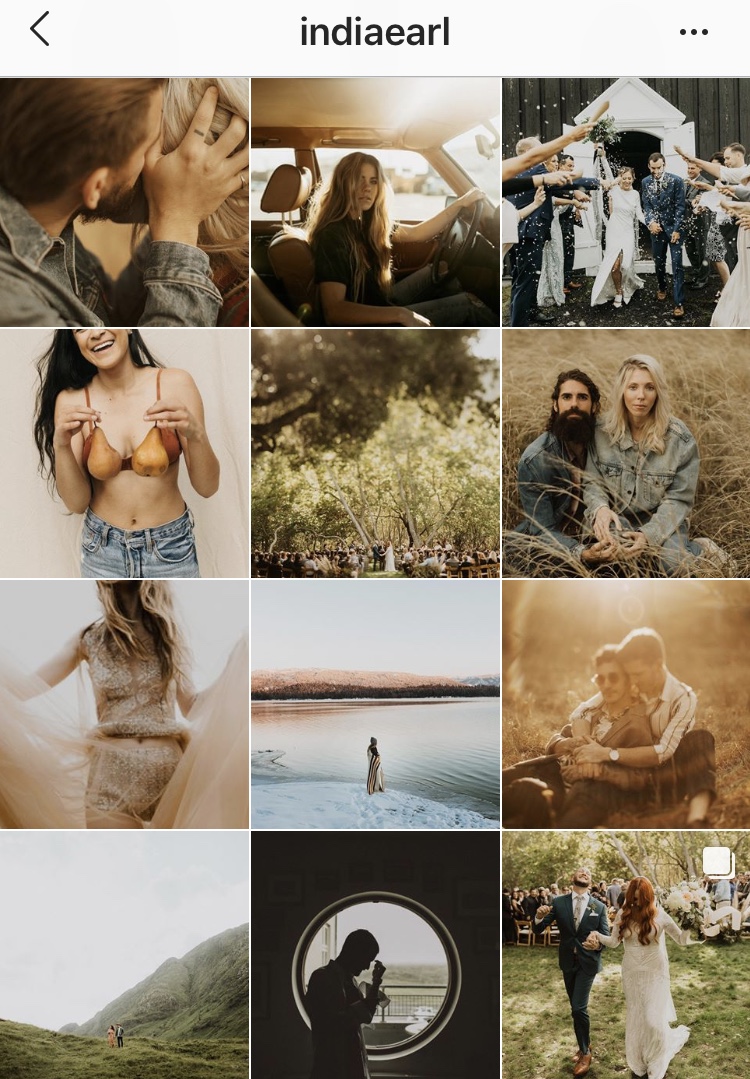
18. Color Overlay
You can choose any color you’d like but having a specific color overlay can help bring your feed together since it will make your photos similar in tone. Green, blue, orange, pink. Whichever color you choose, stick to it!
Below, @kattislundin sticks to a pink tone, where @indiaearl chooses a green/orange edit.
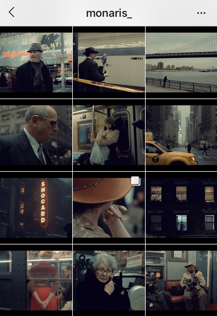
19. Black Border
Taking a dive into the theme of borders, black borders are great for making your Instagram feed look extremely neat and orderly! Very useful for film and photographers!
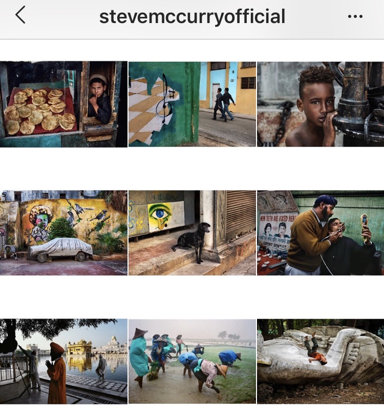
20. Horizontal White Border
Sticking to one style of border (whether that be horizontal or vertical) is a creative way to make your feed stand out. The horizontal style is especially useful for telling a story when viewers scroll through your feed. You’re able to view each image entirely instead of being constrained to Instagram’s box dimensions.
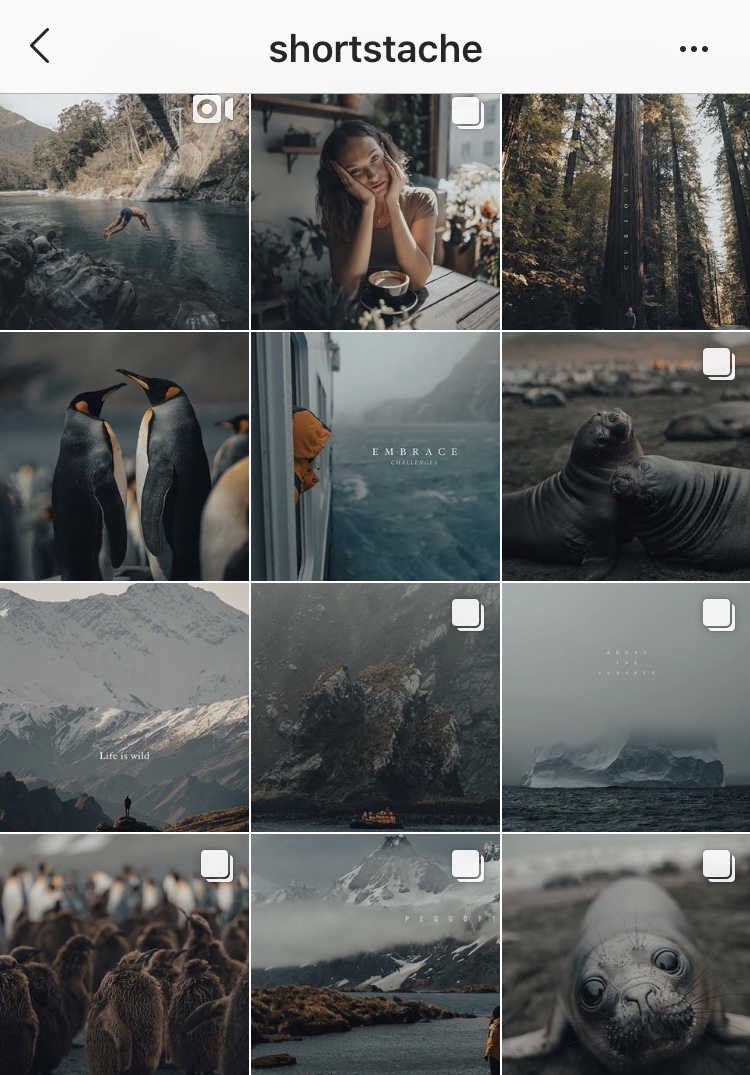
21. Muted Color
Not exactly black and white, but not too colorful either. Muting the color of your images make it so no one specific image stands out too much amongst the rest.
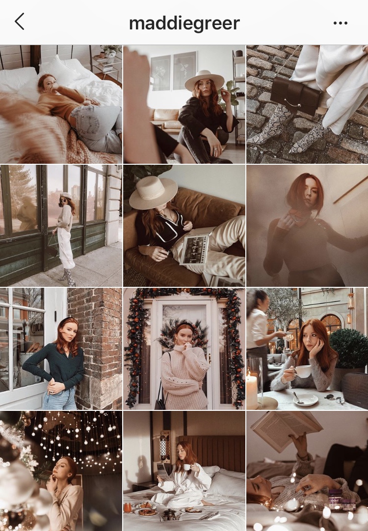
22. Warm Edit
Making sure all of your photos are edited with the same tone type is useful in bringing your feed together and making sure your photos match without using the same filter. Bring out the warm tones in your images to give your Instagram feed a cozy glow.
23. Cool Edit
And of course, if there’s a warm edit, there’s a cool edit as well!
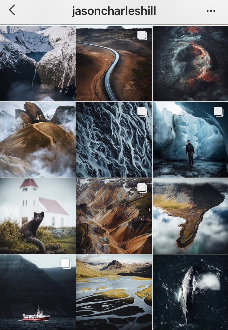
24. Mixed White border
This Instagram feed theme will create space between your photos so they stand out, while also creating an art gallery-esque viewing experience. This works well for users who have both vertical and horizontal images they’d like to share.
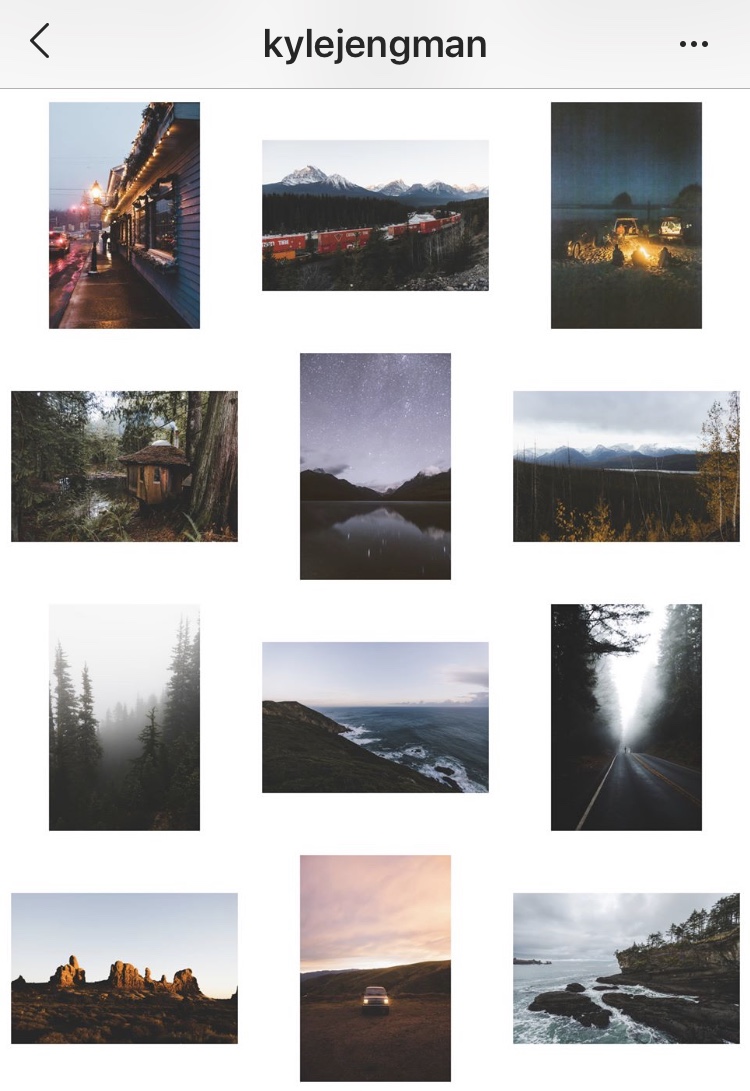
25. Thin Mixed White Border
The same premise as the mixed white border, just thinner so there’s less room between images.
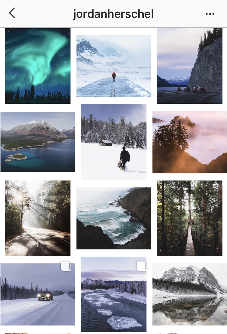
26. One Theme
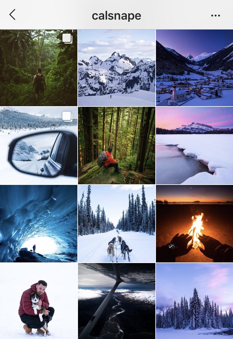
Focus on something often? Then sprinkle it throughout your feed! If you have a lot of content where there is a specific theme involved, try to incorporate it either in every other post or in every third post, just as @calsnape does with snow!
As bad as it sounds, everyone judges a book by it’s cover especially when it comes to Instagram feed aesthetics. With a feed that is pleasing to the eye, it is that much more intriguing for a new user and they will want to spend more time on your page – which is the goal!
Create a unique experience for your viewers by telling a story and leaving people wanting more – a.k.a. wanting to scroll through the rest of your page since your Instagram feed theme is so alluring!
Boostly is the #1 Instagram Growth Service to help you build an engaged audience, drive traffic and generate sales from Instagram! Get started for free today:

